Social Media Image Prompts: 10 GPT Image 2 Templates for Faster Posts
Use 10 copyable social media image prompts for GPT Image 2, with prompt anatomy, iteration rules, post formats, and quick fixes for better posts.
If you search social media image prompts, you usually do not need another giant list with vague aesthetic ideas. You need prompts that already map to real post types, real crops, and real failure modes. On GPTIMG2 AI, the useful split is simple: browse examples in the GPT Image 2 prompt library, then move into the GPT Image 2 workspace to adapt one clear template at a time.
Quick answer
- Strong social media image prompts define the deliverable first: feed post, carousel opener, story cover, launch graphic, quote card, or before/after frame.
- The fastest way to improve results is to lock the subject truth, then change only one layer at a time: format, scene, text policy, or lighting.
- If text accuracy matters, keep the visible copy short and explicit instead of asking the model to render a full paragraph.
- Use the prompt library for inspiration and pattern matching.
- Use the workspace when you need repeatable iterations, reference-image preservation, or fast A/B prompt edits.
The prompt anatomy that keeps social visuals usable
Most social prompts fail because they ask for style but not for the post job. Start with this structure.
| Prompt part | What to specify | Why it matters |
|---|---|---|
| Asset type | Feed post, carousel cover, story cover, launch graphic, quote card, ad creative | Tells the model what kind of composition to build |
| Platform or crop | 1:1 square, 4:5 portrait, 9:16 vertical, 16:9 banner | Prevents layout drift |
| Subject truth | Product, founder, UI, packaging, scene, colors, logo placement | Keeps the image tied to the real brand asset |
| Message goal | Launch, education, proof, quote, sale, transformation, testimonial | Makes the image support the caption instead of fighting it |
| Styling cues | Editorial, minimal, bold, playful, polished, premium, realistic | Gives a mood without replacing the post brief |
| Text policy | No text, short headline only, exact quote only, leave negative space | Reduces broken typography |
| Negative rules | No extra products, no fake logos, no clutter, no unreadable text | Removes the most common failures |
Base formula:
Create a [asset type] for a [platform or crop] social media post.
Feature [subject or product] as the main focus and preserve the exact [brand colors, packaging, logo placement, UI details, or subject truth].
The visual goal is [launch, education, proof, quote, sale, transformation, testimonial].
Use [scene, lighting, camera/composition, styling cues].
Leave [negative space or exact text placement instruction] if text needs to be added.
Do not add [extra products, fake claims, distorted logos, clutter, unreadable text, random props].
That structure works well on GPTIMG2 AI because you can keep the brief stable, then rerun only the variable you want to test.
When to stay in the prompt library and when to open the workspace
Stay on the prompt library when you still need:
- a starting direction
- visual category ideas
- prompt vocabulary for a new brand mood
- a fast way to compare examples before you write your own prompt
Go straight into the GPT Image 2 workspace when:
- the post type is already clear
- you need to preserve a real product, screenshot, or brand element
- you want to compare multiple prompt versions quickly
- you are building a sequence of related assets for the same campaign
The library is the browse layer. The workspace is the execution layer.
10 copyable social media image prompts
These are starter templates, not final copy. Replace the bracketed parts with your campaign details.
1. Product launch feed post
Use this when the goal is a clean announcement image for a new feature or product.
Create a premium social media launch graphic for a square feed post.
Feature [product or feature] as the hero subject and preserve the exact product shape, logo placement, packaging, or UI details from the reference.
Use a clean editorial composition with layered depth, realistic lighting, and a modern brand-forward color palette.
Leave clear negative space in the upper third for a short headline.
The visual goal is "new launch" rather than hard-sell discount advertising.
Do not add fake badges, unreadable text, extra products, or busy background clutter.
Best for: launch posts, roadmap reveals, new feature graphics.
2. Instagram carousel opener
Use this when the first slide has to stop the scroll and set up a sequence.
Create a bold 4:5 Instagram carousel cover image.
Feature [topic, product, or idea] with one dominant visual subject and a clear focal point.
Use high contrast, structured composition, and enough clean space for a short hook.
The image should feel polished, modern, and easy to read on mobile.
Add the headline text exactly: "[SHORT HOOK]".
Do not cram multiple ideas into the same frame, add dense paragraphs, or use cluttered backgrounds.
Best for: educational carousels, launch series, "5 ideas" posts, framework slides.
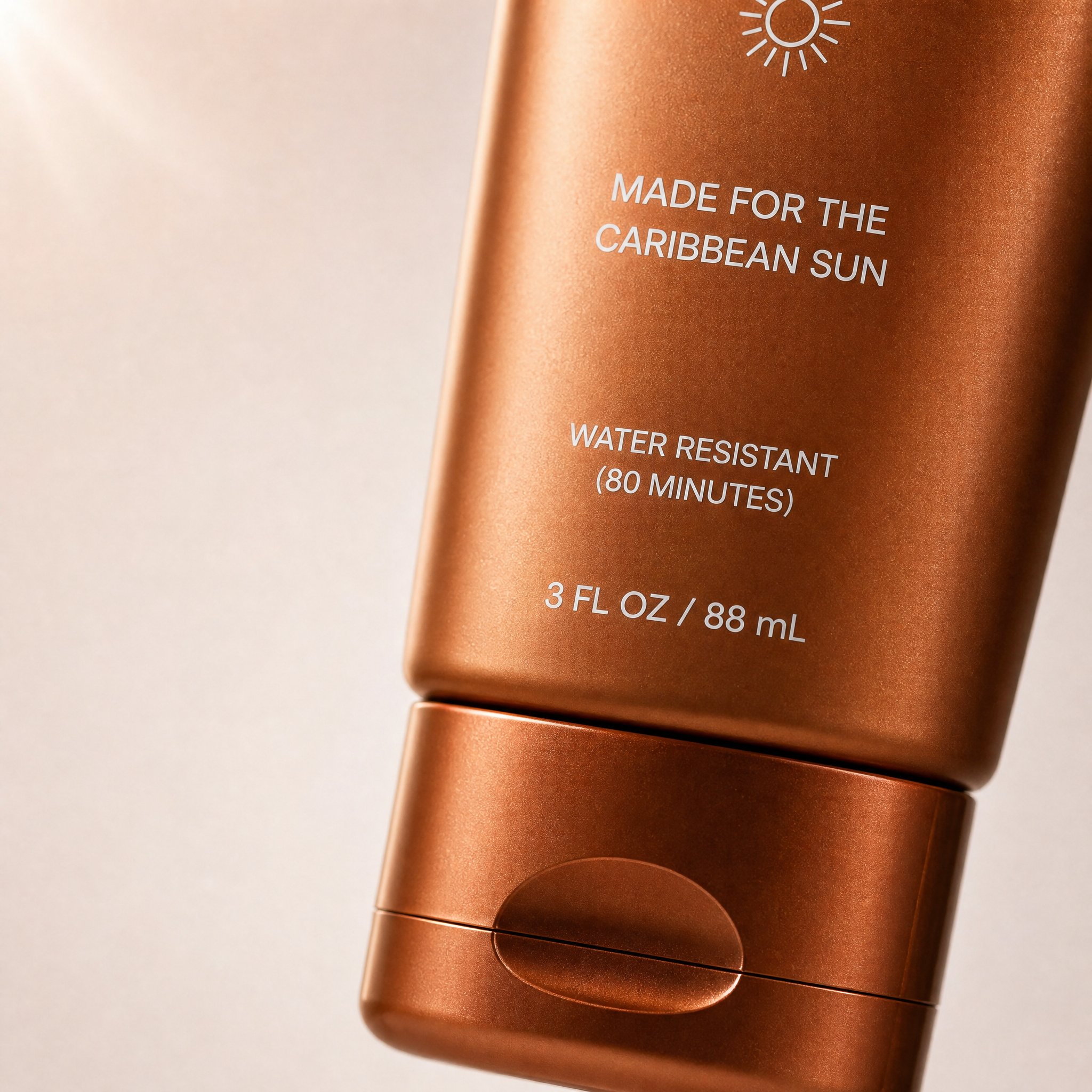
A real carousel-style example from the prompt library. It works because the crop, subject focus, negative space, and DTC visual tone all match the "carousel opener" job.
Matching prompt from the prompt library:
Create a high-converting carousel image for this brand [PRODUCT] Ultra-clean, Apple-style design.
extreme macro shot to see the text "MADE FOR THE CARIBBEAN SUN", at the exact position it's currently is in the label. don't change the label or anything else. lots of negative space. Hyper-realistic 3D renders.

Soft gradient background, premium lighting, subtle shadows. Focus on simplicity, clarity, and elegance. No text. Mobile-first, 4:5, high-end DTC aesthetic.
3. Quote card with brand mood
Use this when the caption or comment thread matters, but the image still needs to look intentional.
Create a branded quote-card visual for a square social post.
Use a minimal background, one supporting visual motif, and clean typography space.
Add the quote text exactly: "[SHORT QUOTE]".
Use the brand palette [describe colors] and keep the layout elegant, high-contrast, and mobile-readable.
The image should feel editorial rather than meme-like.
Do not add decorative clutter, fake signatures, long paragraphs, or tiny unreadable text.
Best for: founder quotes, customer insight posts, brand principles.
4. Product plus negative-space layout
Use this when the product must stay visible and the team wants to add text later in the design tool.
Create a square product-focused social media image.
Preserve the exact product identity, color, label placement, packaging, and proportions.
Place the product on a clean branded surface with realistic lighting and subtle depth.
Keep the product large and sharp, but leave generous negative space on the right side for later headline placement.
The mood should feel premium, modern, and conversion-friendly.
Do not add extra text, extra props, fake benefits, or secondary products.
Best for: evergreen feed posts, ad variations, organic product spotlights.
5. Before-and-after transformation post
Use this for editing, makeover, redesign, or workflow-proof posts.
Create a split-frame social media image that clearly shows a before-and-after transformation.
Use the left side for "before" and the right side for "after" with consistent framing and clear contrast.
Preserve the same subject identity across both sides.
The result should feel realistic, not exaggerated, and easy to understand in one glance.
Add minimal labels exactly: "Before" and "After".
Do not invent impossible changes, distort the subject, or use noisy visual effects that hide the comparison.
Best for: retouching proof, creative workflow posts, UI redesign reveals.
6. UGC-style creator post
Use this when a polished brand image feels too formal and you want a more human social look.
Create a realistic UGC-style social image for a mobile feed post.
Feature [person, product, or object] in a believable handheld or casual lifestyle context.
Use natural light, authentic framing, and a creator-style composition that feels spontaneous but still clean.
Keep the product or message visible without making the scene look like stock photography.
Leave subtle space for a short caption overlay if needed.
Do not make the image over-produced, fantasy-styled, or cluttered with props.
Best for: creator partnerships, organic product mentions, soft-sell campaigns.
7. Seasonal campaign visual
Use this when the post needs a timely hook without looking like a generic holiday template.
Create a branded seasonal campaign visual for a square or 4:5 social post.
Feature [product or message] as the main subject and preserve the exact brand identity.
Add seasonal cues for [holiday or campaign moment] in a restrained, premium way.
Use a clear focal point, realistic lighting, and a campaign-ready composition.
Leave space for one short promotional line.
Do not overuse seasonal props, neon effects, fake discount stickers, or unrelated decorative elements.
Best for: holiday drops, spring or summer campaigns, limited-time announcements.
8. Story or Reel cover
Use this when the post will live in a vertical format and needs immediate clarity.
Create a 9:16 vertical story cover image for social media.
Use one dominant subject, strong vertical composition, and enough empty space in the top and bottom safe zones for interface overlays.
The image should feel bold, simple, and readable on mobile in one second.
Add the headline text exactly: "[SHORT TITLE]".
Do not place important details near the edges, add tiny text, or overload the frame with multiple focal points.
Best for: story sequences, Reel covers, short-form video title cards.
9. Testimonial backdrop
Use this when the real proof will be added later as text, but the image still needs to feel trustworthy.
Create a calm testimonial-style social background image for a square or portrait post.
Use a clean, premium composition with subtle brand texture, realistic lighting, and a supportive visual motif related to [product, workspace, category, or customer context].
Leave a large centered text-safe area for a testimonial overlay.
The design should feel credible, polished, and easy to read on mobile.
Do not add fake review stars, cluttered props, or busy patterns behind the text area.
Best for: customer proof, case-study highlights, community feedback posts.
10. LinkedIn or X launch graphic
Use this when the post has to feel sharp and credible rather than decorative.
Create a social launch graphic optimized for a professional platform post.
Feature [product, founder, dashboard, or UI] with a clean high-contrast composition and a restrained brand palette.
The visual goal is clarity, credibility, and product relevance.
Leave space for a short headline or metric callout.
Use realistic lighting, crisp edges, and a polished modern software-brand aesthetic.
Do not use childish icons, loud gradients, fake metrics, or busy decorative effects.
Best for: B2B announcements, founder updates, product releases, feature drops.
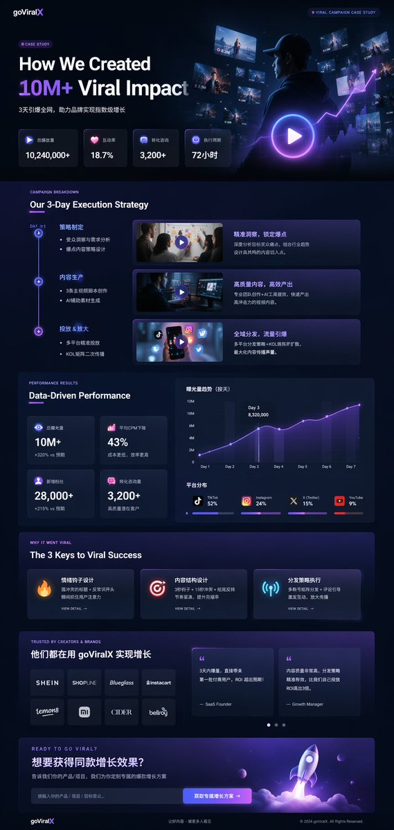
A professional launch and case-study style example from the prompt library. It is useful for LinkedIn or X posts because it combines product framing, metrics, hierarchy, and a credible software-brand visual language.
Matching prompt structure from the prompt library:
{
  "type": "UI/UX landing page mockup",
  "theme": "dark mode, sleek modern aesthetic, glassmorphism, {argument name=\"primary accent color\" default=\"neon purple and blue\"} glowing accents",
  "header": {
    "logo": "{argument name=\"brand name\" default=\"goViralX\"}",
    "top_right_tag": "VIRAL CAMPAIGN CASE STUDY"
  },
  "layout": {
    "sections": [
      {
        "name": "Hero",
        "headline": "{argument name=\"hero headline\" default=\"How We Created 10M+ Viral Impact\"}",
        "visual": "cinematic shot of a person in a hoodie looking at glowing digital screens and graphs"
      }
    ]
  }
}
How to adapt one good prompt instead of rewriting everything
The fastest workflow is not "write ten different prompts." It is "hold the subject truth steady and change one layer at a time."
Use this order:
- lock the asset type
- lock the subject truth
- change the crop or platform
- change the message goal
- change the scene or lighting
- only then change the text policy
Example:
- Carousel opener: bold 4:5 hook, one message, one subject
- Feed post: same subject, calmer composition, no text
- Story cover: same subject, vertical crop, top and bottom safe zones
- Professional launch graphic: same subject, muted palette, more negative space
That is where GPTIMG2 AI becomes practical. You can keep the campaign direction stable while producing multiple social assets from one prompt family.
Quick fixes when the prompt output is weak
| If the result fails because... | Change this first | Why |
|---|---|---|
| The post looks generic | Replace style words with a real asset type and platform crop | Specific deliverables beat aesthetic-only prompts |
| The image has too many ideas | Remove extra text requests and secondary subjects | Social graphics break when one frame tries to explain everything |
| Typography looks wrong | Ask for less text or reserve negative space instead | Short exact strings are safer than long rendered copy |
| The brand feels lost | Add brand colors, product truth, and one visual anchor | Mood-only prompts drift fast |
| The image feels fake | Simplify the lighting and reduce decorative props | Over-styling usually hurts realism |
| The composition feels cramped | Change the crop before rewriting the whole prompt | Layout issues are often format issues first |
A practical GPTIMG2 workflow for social posts
- browse the prompt library to find the closest asset pattern
- copy one of the prompt structures above
- open the GPT Image 2 workspace
- upload a reference if product identity, UI accuracy, or brand consistency matters
- run one clean version without too much text
- adjust only one variable per retry
- export the best base image and finish typography in your design tool if exact copy fidelity matters
If you also need a product-first template system, use Product Photo Prompt Templates as the adjacent workflow page.
FAQ
What makes a social media image prompt different from a general image prompt?
A social media image prompt has to respect feed behavior, mobile crops, caption support, and scroll-stopping clarity. The prompt should describe the post job, not just the image style.
Should I ask the model to render all of my post copy?
Usually no. Short exact phrases can work, but longer copy often breaks. It is safer to ask for negative space and add detailed text later in a design tool.
Which crop should I define first?
Define the crop as soon as you know the destination. A 9:16 story cover, a 4:5 carousel opener, and a square feed post need different compositions even when the visual idea is the same.
When do I need a reference image?
Use a reference when the product, package, UI, or brand detail has to stay accurate. Prompt-only generation is better for concepting than for identity preservation.
How many variations should I test?
Start with one clean baseline and change one variable at a time. Three to five controlled variations usually teach you more than ten unrelated prompts.
Should this article replace the prompt library?
No. This page is the execution guide. The GPT Image 2 prompt library remains the canonical example hub for browsing and discovery.
Final takeaway
The useful social media image prompts workflow is not about collecting endless examples. It is about choosing the right post format, writing a prompt that matches that format, and iterating without losing the brand signal.
Use this page as the working grammar. Use the GPT Image 2 prompt library as the example bank. Then use the GPT Image 2 workspace to turn one strong prompt family into a full set of social assets faster.