Figma UI Screenshot Prompts: Copy-Ready GPT Image 2 Templates
Use Figma UI screenshot prompts for GPT Image 2 with product context, layout hierarchy, readable UI copy, QA checks, and practical team fixes.
If you need figma ui screenshot prompts, start with a prompt that describes the screen like a design spec: product context, device frame, layout zones, visible UI copy, component states, spacing, and what must stay readable. GPT Image 2 can produce strong screenshot-style mockups when the prompt asks for interface structure instead of only asking for a "clean modern UI."
Use the templates below in the GPT Image 2 workspace, then browse the GPT Image 2 prompts library when you need more page, app, ecommerce, or dashboard patterns.
The prompt structure that works best
A reliable Figma-style screenshot prompt has six parts:
| Prompt part | What to include | Why it matters |
|---|---|---|
| Product context | App category, user, job to be done | Prevents a generic Dribbble-style screen |
| Canvas | Desktop, mobile, tablet, dashboard, modal, design board | Controls framing before style |
| Layout zones | Navigation, hero, cards, side panel, table, form, CTA | Keeps hierarchy believable |
| Exact UI copy | Headline, labels, tabs, buttons, empty states | Reduces fake text and vague blocks |
| Visual system | Typography mood, palette, density, radius, shadows | Makes the screenshot feel coherent |
| Constraints | No distorted text, no duplicate nav, no impossible controls | Catches common AI UI failures |
Do not ask for an editable Figma file unless your workflow includes a separate screenshot-to-Figma step. GPT Image 2 is better used here for visual directions, stakeholder-ready mockups, pitch screenshots, and design exploration before rebuilding the real interface.
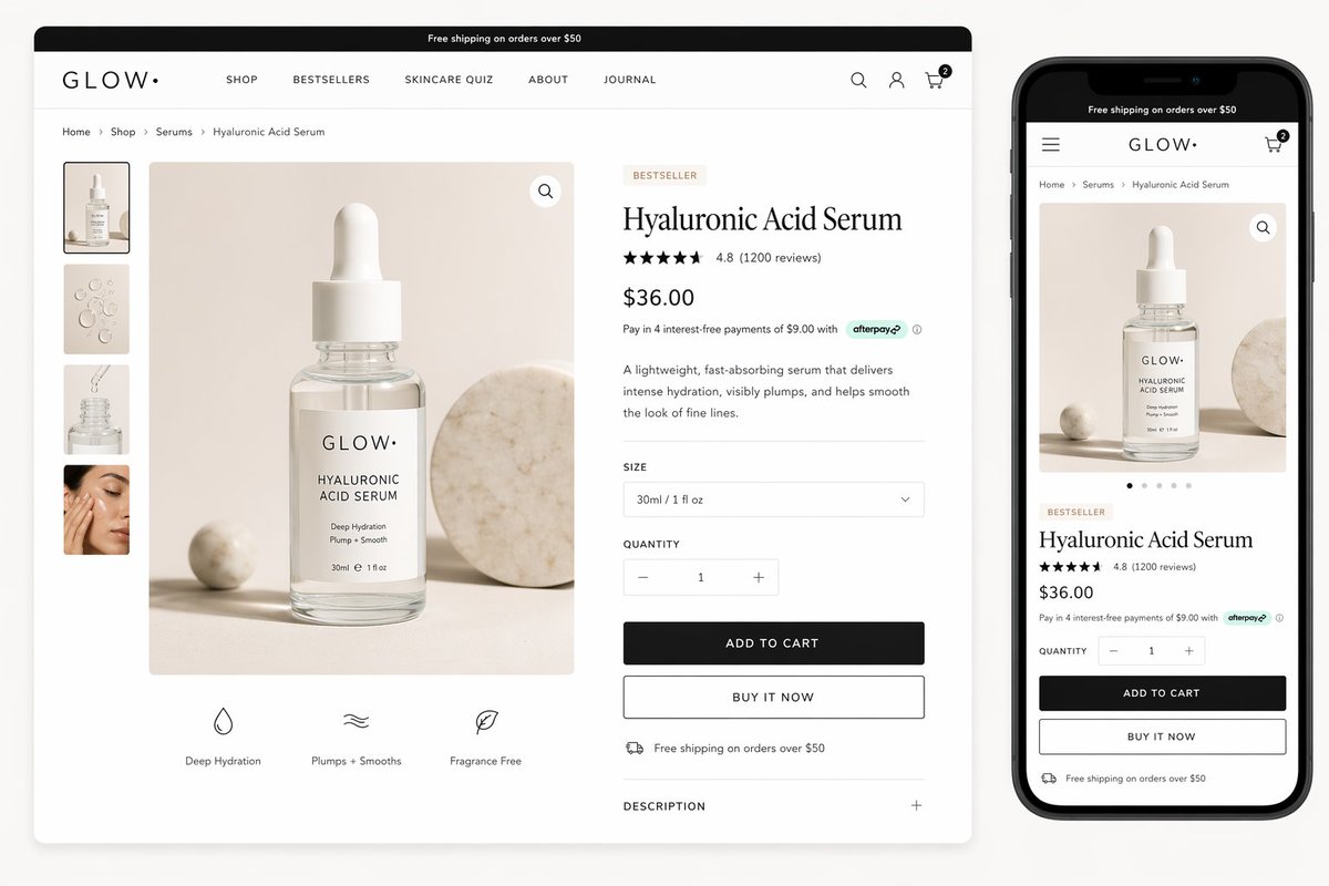
Prompt 1: Screenshot recreation from a rough UI idea
Use this when you have a simple product idea and want a screenshot-like interface that looks ready enough to discuss with a designer or founder.
Create a realistic Figma-style UI screenshot for a [PRODUCT CATEGORY] app used by [TARGET USER].

Screen:
- Device: [desktop web app / mobile app / tablet dashboard]
- View name: [specific screen name]
- User goal: [what the user is trying to accomplish]

Layout:
- Top navigation with [logo text], [3-5 nav items], search, and account area
- Main content area with a clear page title: "[EXACT TITLE]"
- Primary action button: "[EXACT BUTTON TEXT]"
- [2-4] content cards or panels, each with readable labels and realistic values
- One secondary panel for status, activity, filters, comments, or recommendations

Visual style:
- Clean Figma mockup aesthetic, crisp UI, balanced spacing, believable component hierarchy
- Use [COLOR PALETTE], [TYPOGRAPHY MOOD], and [DENSITY: spacious / compact / enterprise]
- Subtle shadows, consistent border radius, aligned grid, no decorative clutter

Text requirements:
- All visible UI text must be readable
- Use realistic labels, not lorem ipsum
- Keep button labels short and practical

Avoid:
- Warped text, duplicated navigation bars, impossible controls, random icons, crowded cards, fake chart axes, and blurry small labels

Output:
- High-resolution screenshot-style mockup
- Straight-on view, not angled
- Looks like a polished Figma presentation frame
Why it works: the prompt names the screen, then forces the output to respect navigation, content hierarchy, copy, and constraints. That is much stronger than make a Figma UI screenshot for a finance app.
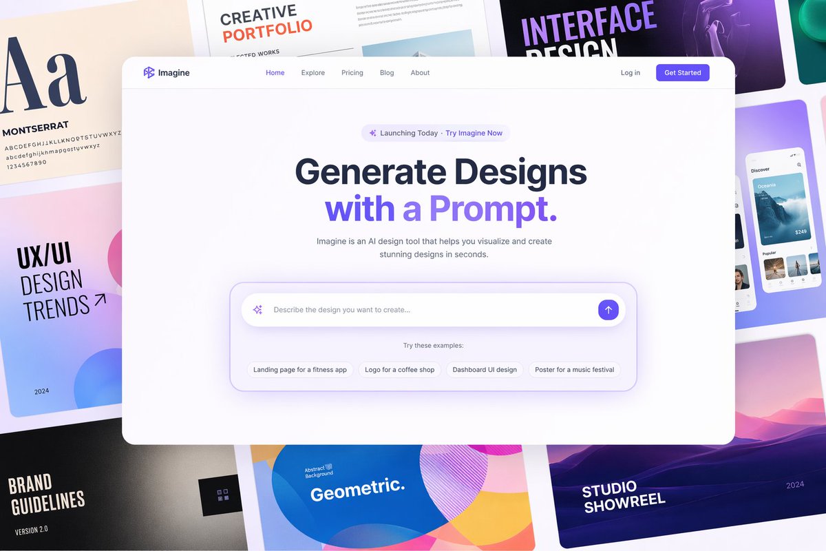
Prompt 2: Figma Make-style landing page mockup
Use this template when you want a full product page concept with enough structure to rebuild later.
Design a polished Figma-style landing page screenshot for [PRODUCT NAME], a [ONE-SENTENCE PRODUCT DESCRIPTION].

Canvas:
- Wide desktop website mockup, straight-on screenshot
- Include a smaller mobile preview on the right side only if there is enough space
- White or soft neutral background, realistic web spacing

Page sections visible in one screenshot:
1. Announcement bar with exact text: "[ANNOUNCEMENT]"
2. Header with logo "[LOGO TEXT]", nav items [NAV ITEMS], and one right-side CTA
3. Hero section with headline "[HEADLINE]" and subheadline "[SUBHEADLINE]"
4. Prompt/input/search module or product preview module in the hero
5. Feature row with [3 FEATURES]
6. Social proof, rating, or customer count

Design system:
- [BRAND PERSONALITY: calm SaaS / premium ecommerce / playful creator tool / enterprise analytics]
- Palette: [COLORS]
- Typography: readable modern sans-serif, clear H1 scale, compact UI labels
- Components: consistent cards, buttons, inputs, tabs, badges, and icons

Quality constraints:
- All important text must be legible
- Do not invent unrelated sections
- Do not crop the primary CTA
- Keep alignment, spacing, and visual hierarchy credible
- No placeholder gibberish or broken letters

Output:
- High-resolution UI screenshot
- Presentation-ready, like a Figma frame exported for a product review
The key is section order. GPT Image 2 needs to know what appears above the fold, which modules are visible, and which pieces of copy must be readable. When the prompt says only "SaaS landing page," the model may generate a polished but unusable fantasy layout.
Prompt 3: Screenshot-to-redesign prompt
Use this when you have a rough screenshot, wireframe, or old UI and want GPT Image 2 to propose a cleaner version while preserving the information architecture.
Use the attached screenshot as the source structure. Redesign it as a modern Figma-style UI mockup while preserving the same user task, page hierarchy, and core content.

Preserve:
- The same screen purpose
- The same primary navigation groups
- The same important labels and actions
- The same data relationships, tables, forms, or cards
- The same relative priority between primary and secondary actions

Improve:
- Visual hierarchy
- Spacing and alignment
- Typography scale
- Button and input consistency
- Empty states, filter states, or status badges where appropriate
- Overall polish for a product review presentation

Style direction:
- [DESIGN SYSTEM DIRECTION]
- [COLOR PALETTE]
- [DENSITY]
- [PLATFORM: web dashboard / iOS app / Android app / responsive website]

Constraints:
- Do not remove important controls from the original screenshot
- Do not add unrelated product features
- Do not turn the interface into a marketing poster
- Keep readable UI text
- Keep the result as a flat screenshot, not an angled device render

Output:
- A clean redesigned UI screenshot
- Looks like an exported Figma frame
This is the safer way to use image prompting for screenshot redesigns: ask GPT Image 2 to preserve relationships first, then improve style second.
Prompt 4: Prompt sheet for repeatable UI screenshots
If your team needs consistent outputs, write the prompt as a spec sheet. This is especially useful for content teams making many app screenshots for blog posts, ads, or launch pages.
{
  "type": "figma_style_ui_screenshot",
  "product": {
    "name": "[PRODUCT NAME]",
    "category": "[CATEGORY]",
    "audience": "[TARGET USER]",
    "screen_goal": "[USER GOAL]"
  },
  "canvas": {
    "platform": "[desktop_web | mobile_app | tablet_dashboard]",
    "view": "[SCREEN NAME]",
    "framing": "straight-on exported Figma frame",
    "density": "[spacious | balanced | compact]"
  },
  "layout": {
    "navigation": "[NAV STRUCTURE]",
    "primary_zone": "[MAIN MODULE]",
    "secondary_zone": "[SUPPORTING MODULE]",
    "states": ["[STATE 1]", "[STATE 2]", "[STATE 3]"]
  },
  "copy": {
    "headline": "[EXACT HEADLINE]",
    "primary_cta": "[EXACT CTA]",
    "labels": ["[LABEL 1]", "[LABEL 2]", "[LABEL 3]"]
  },
  "style": {
    "palette": "[COLOR PALETTE]",
    "typography": "[TYPOGRAPHY DIRECTION]",
    "components": "consistent buttons, tabs, cards, fields, badges, and icons"
  },
  "constraints": [
    "readable text",
    "no fake lorem ipsum",
    "no duplicated nav",
    "no distorted controls",
    "no angled device perspective"
  ]
}
JSON-style prompts are not magic, but they make omissions obvious. If a generated screenshot misses a table state or repeats a button, you can revise the relevant field without rewriting the whole prompt.
What to check before rebuilding in Figma
Treat the GPT Image 2 result as a visual brief, not finished product design. Before you recreate it in Figma, check:
- Does the screen have one obvious primary action?
- Are cards, tabs, tables, and forms aligned to a believable grid?
- Is the copy real enough for a stakeholder review?
- Are important controls visible at the right priority?
- Does the mobile version preserve the same task, or only shrink the desktop image?
- Are charts, metrics, and badges plausible?
- Would this UI still work with longer labels or real data?
For screenshot-to-Figma workflows, tools that convert images into editable layers can help with tracing, but the designer still needs to correct hierarchy, components, variants, responsiveness, and accessibility.
Common prompt fixes
| Problem in output | Add this to the next prompt |
|---|---|
| Text is garbled | "Use fewer visible text elements; only the headline, nav labels, and buttons need readable text." |
| Layout is too decorative | "Prioritize realistic product UI over marketing illustration or poster composition." |
| Too many cards | "Limit the screen to one primary module and three supporting cards." |
| Cropped buttons | "Keep all primary controls fully visible inside the frame." |
| Looks like a template | "Include product-specific labels, realistic data, and one distinctive workflow detail." |
| Weak Figma feel | "Straight-on exported Figma frame, aligned grid, consistent components, no angled device mockup." |
Review checklist before handing the screenshot to design
A GPT Image 2 UI screenshot is most useful when it helps a product team discuss structure. It does not need to be an editable Figma file, but it should make the intended product, page hierarchy, and component relationships clear enough for a designer to rebuild. Before sharing a generated mockup, review it like a product screenshot: what screen is this, who is using it, what action is primary, and which UI details must survive into the real design?
The strongest prompts keep style secondary to structure. Start with product context and screen purpose, then specify layout zones, then add exact UI copy, then add visual style. If you lead with "beautiful modern dashboard," the model may produce a polished but unusable screen. If you lead with "customer support triage dashboard with queue health, SLA risk, agent workload, and one primary action," the output is easier to judge and rebuild.
| Review area | Strong output | Fix when weak |
|---|---|---|
| Product context | Labels match the industry and workflow | Add domain-specific objects, states, and user goals |
| Layout hierarchy | Primary action, navigation, and content zones are obvious | Name the zones and cap the number of cards or panels |
| UI copy | Headings and buttons are short enough to read | Provide exact button labels and ban lorem ipsum |
| Rebuild value | A designer can map the image to components | Ask for grids, states, spacing, and consistent component shapes |
Use GPTIMG2 AI to explore direction, then rebuild the approved structure in Figma or code. When a result is close, iterate with narrow fixes: preserve the same layout, reduce decorative clutter, make the table labels readable, remove duplicate nav bars, or turn the right panel into an activity feed. Those instructions usually improve the screenshot more than asking for a brand-new design.
Example review scenario: turning a rough product idea into a usable screen
Suppose the product idea is an AI inbox that summarizes customer conversations. A weak prompt would ask for "a modern SaaS inbox UI." A stronger prompt names the user, the workflow, the decision states, and the UI hierarchy: support lead, unresolved conversations, urgency score, summary panel, suggested reply, escalation button, and activity history. That extra product context gives GPT Image 2 enough structure to create a screenshot that can be critiqued by a real team.
After generation, review the screenshot in three layers. At the strategy layer, ask whether the image makes the product promise visible without reading every label. At the interaction layer, ask whether the primary action is obvious and whether secondary actions are visually lower priority. At the implementation layer, ask whether the screen can be translated into components: navigation, filters, card list, detail panel, empty state, and status chips. If any layer fails, fix that layer directly in the next prompt instead of adding more visual style.
Use this repair pattern when the output is close: "Keep the same screen and information architecture. Make the primary action more prominent, reduce decorative gradients, make the table and card labels readable, remove duplicated navigation, and keep all UI text short." This preserves the useful structure while removing the artifacts that make AI UI screenshots feel unreviewable.
A final acceptance test is to hand the screenshot to someone who has not read the prompt. If they can identify the product category, the screen purpose, the primary action, and two reusable components, the image is useful. If they only say it looks polished, the prompt still needs more product truth.
FAQ
Can GPT Image 2 generate an editable Figma file?
No. Use GPT Image 2 for screenshot-style mockups and visual directions. If you need editable layers, rebuild the design in Figma or use a screenshot-to-Figma workflow as a separate step.
Should I upload an existing screenshot?
Yes, when you want to preserve structure. Tell GPT Image 2 which parts to preserve, which parts to improve, and which content must remain readable.
What is the best prompt length?
For UI screenshots, a medium-length spec usually works better than a one-line prompt. Include the screen goal, layout zones, exact copy, visual system, and constraints. Remove details that do not affect the visible interface.
How do I make the result less generic?
Add product-specific workflows, real labels, realistic data, and one or two domain details. A healthcare intake screen, an AI prompt library, and an ecommerce product page should not share the same card stack.
Start with a structured prompt
The fastest workflow is simple: choose one template above, replace the bracketed fields, generate a first pass in GPT Image 2, then revise one issue at a time. For more examples, use the GPT Image 2 prompts library as a source of reusable prompt structures, not just finished images.