SNS画像プロンプト: GPT Image 2で使える10個のテンプレート
GPT Image 2向けのSNS画像プロンプト10本に加えて、プロンプト構造、調整順序、よくある失敗の直し方をまとめました。
social media image prompts を探しているとき、本当に必要なのは曖昧なアイデア集ではありません。実際の投稿タイプ、実際の比率、実際の失敗パターンに対応したプロンプトです。GPTIMG2 AI では、まず GPT Image 2 prompt library で近い作例を見つけ、そのあと GPT Image 2 workspace で1つの明確なテンプレートを少しずつ調整するのが最短です。
先に結論
- 強いSNS画像プロンプトは、最初に deliverable を決めます。feed post、carousel cover、story cover、launch graphic、quote card、before/after などです。
- 結果を速く改善するには、subject truth を固定し、format・scene・text policy・lighting のどれか1つだけを変えます。
- 文字の正確さが大事なら、長文ではなく短いフレーズだけを描かせる方が安全です。
- 発想を探す段階では prompt library。
- 反復、reference image、A/B テストが必要なら workspace。
使いやすい結果を出しやすいプロンプト構造
多くのSNS画像が崩れる理由は、スタイルだけを書いて、投稿の役割を書いていないからです。
| 要素 | 何を書くか | なぜ重要か |
|---|---|---|
| Asset type | Feed post、carousel cover、story cover、launch graphic、quote card、ad creative | 構図の仕事を明確にする |
| Platform / crop | 1:1、4:5、9:16、16:9 | レイアウトの崩れを防ぐ |
| Subject truth | Product、founder、UI、packaging、brand colors、logo placement | 実在のブランド要素を守る |
| Message goal | Launch、education、proof、quote、sale、transformation、testimonial | 画像を投稿目的に合わせる |
| Styling cues | Editorial、minimal、bold、playful、premium、realistic | brief を壊さずに雰囲気を足す |
| Text policy | No text、short headline only、exact quote only、negative space | タイポ崩れを減らす |
| Negative rules | No extra products、no fake logos、no clutter、no unreadable text | よくある失敗を先に防ぐ |
基本式:
Create a [asset type] for a [platform or crop] social media post.
Feature [subject or product] as the main focus and preserve the exact [brand colors, packaging, logo placement, UI details, or subject truth].
The visual goal is [launch, education, proof, quote, sale, transformation, testimonial].
Use [scene, lighting, camera/composition, styling cues].
Leave [negative space or exact text placement instruction] if text needs to be added.
Do not add [extra products, fake claims, distorted logos, clutter, unreadable text, random props].
prompt library に残るべき時と workspace を開くべき時
prompt library に残るのは、次がまだ必要な時です。
- 出発点となる方向性
- ビジュアルカテゴリの候補
- プロンプト語彙
- 自分で書く前の比較材料
GPT Image 2 workspace にすぐ移るのは、次の時です。
- 投稿タイプがもう決まっている
- 実在の商品、スクリーンショット、ブランド要素を守りたい
- 複数バージョンをすばやく比較したい
- 同じキャンペーンの素材を連続で作りたい
そのまま使えるSNS画像プロンプト10本
1. 商品ローンチ用フィード画像
Create a premium social media launch graphic for a square feed post.
Feature [product or feature] as the hero subject and preserve the exact product shape, logo placement, packaging, or UI details from the reference.
Use a clean editorial composition with layered depth, realistic lighting, and a modern brand-forward color palette.
Leave clear negative space in the upper third for a short headline.
The visual goal is "new launch" rather than hard-sell discount advertising.
Do not add fake badges, unreadable text, extra products, or busy background clutter.
2. Instagramカルーセルの1枚目
Create a bold 4:5 Instagram carousel cover image.
Feature [topic, product, or idea] with one dominant visual subject and a clear focal point.
Use high contrast, structured composition, and enough clean space for a short hook.
The image should feel polished, modern, and easy to read on mobile.
Add the headline text exactly: "[SHORT HOOK]".
Do not cram multiple ideas into the same frame, add dense paragraphs, or use cluttered backgrounds.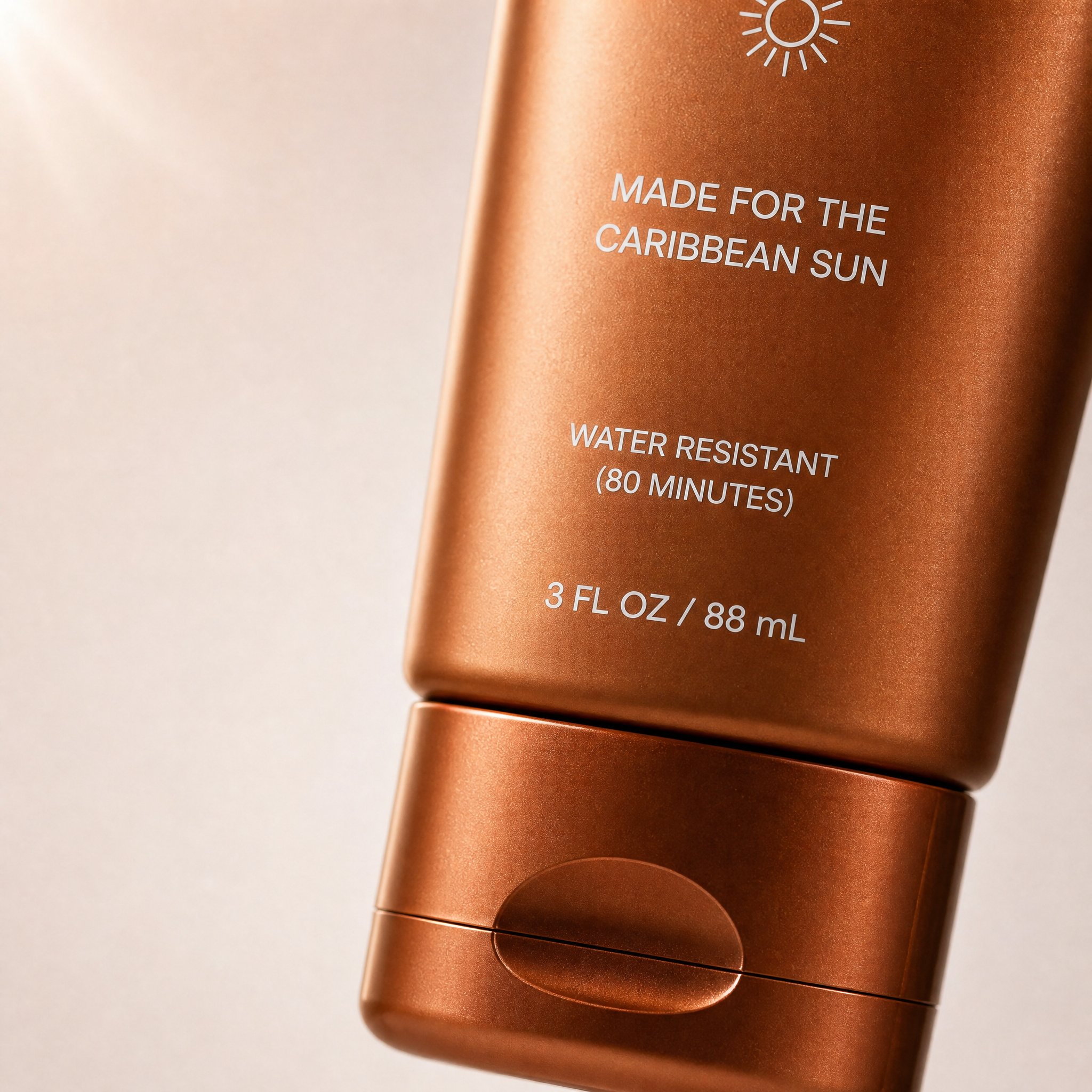
これは prompt library にある実際の carousel 例です。crop、主役の置き方、negative space、DTCらしいトーンが「カルーセル1枚目」の役割ときれいに一致しています。
対応する prompt library の prompt:
Create a high-converting carousel image for this brand [PRODUCT] Ultra-clean, Apple-style design.
extreme macro shot to see the text "MADE FOR THE CARIBBEAN SUN", at the exact position it's currently is in the label. don't change the label or anything else. lots of negative space. Hyper-realistic 3D renders.

Soft gradient background, premium lighting, subtle shadows. Focus on simplicity, clarity, and elegance. No text. Mobile-first, 4:5, high-end DTC aesthetic.
3. ブランドのクオートカード
Create a branded quote-card visual for a square social post.
Use a minimal background, one supporting visual motif, and clean typography space.
Add the quote text exactly: "[SHORT QUOTE]".
Use the brand palette [describe colors] and keep the layout elegant, high-contrast, and mobile-readable.
The image should feel editorial rather than meme-like.
Do not add decorative clutter, fake signatures, long paragraphs, or tiny unreadable text.
4. 商品 + 余白レイアウト
Create a square product-focused social media image.
Preserve the exact product identity, color, label placement, packaging, and proportions.
Place the product on a clean branded surface with realistic lighting and subtle depth.
Keep the product large and sharp, but leave generous negative space on the right side for later headline placement.
The mood should feel premium, modern, and conversion-friendly.
Do not add extra text, extra props, fake benefits, or secondary products.
5. Before / After 比較
Create a split-frame social media image that clearly shows a before-and-after transformation.
Use the left side for "before" and the right side for "after" with consistent framing and clear contrast.
Preserve the same subject identity across both sides.
The result should feel realistic, not exaggerated, and easy to understand in one glance.
Add minimal labels exactly: "Before" and "After".
Do not invent impossible changes, distort the subject, or use noisy visual effects that hide the comparison.
6. UGC風の投稿画像
Create a realistic UGC-style social image for a mobile feed post.
Feature [person, product, or object] in a believable handheld or casual lifestyle context.
Use natural light, authentic framing, and a creator-style composition that feels spontaneous but still clean.
Keep the product or message visible without making the scene look like stock photography.
Leave subtle space for a short caption overlay if needed.
Do not make the image over-produced, fantasy-styled, or cluttered with props.
7. 季節キャンペーン用ビジュアル
Create a branded seasonal campaign visual for a square or 4:5 social post.
Feature [product or message] as the main subject and preserve the exact brand identity.
Add seasonal cues for [holiday or campaign moment] in a restrained, premium way.
Use a clear focal point, realistic lighting, and a campaign-ready composition.
Leave space for one short promotional line.
Do not overuse seasonal props, neon effects, fake discount stickers, or unrelated decorative elements.
8. Story / Reel カバー
Create a 9:16 vertical story cover image for social media.
Use one dominant subject, strong vertical composition, and enough empty space in the top and bottom safe zones for interface overlays.
The image should feel bold, simple, and readable on mobile in one second.
Add the headline text exactly: "[SHORT TITLE]".
Do not place important details near the edges, add tiny text, or overload the frame with multiple focal points.
9. testimonial 用背景
Create a calm testimonial-style social background image for a square or portrait post.
Use a clean, premium composition with subtle brand texture, realistic lighting, and a supportive visual motif related to [product, workspace, category, or customer context].
Leave a large centered text-safe area for a testimonial overlay.
The design should feel credible, polished, and easy to read on mobile.
Do not add fake review stars, cluttered props, or busy patterns behind the text area.
10. LinkedIn / X 向けローンチ画像
Create a social launch graphic optimized for a professional platform post.
Feature [product, founder, dashboard, or UI] with a clean high-contrast composition and a restrained brand palette.
The visual goal is clarity, credibility, and product relevance.
Leave space for a short headline or metric callout.
Use realistic lighting, crisp edges, and a polished modern software-brand aesthetic.
Do not use childish icons, loud gradients, fake metrics, or busy decorative effects.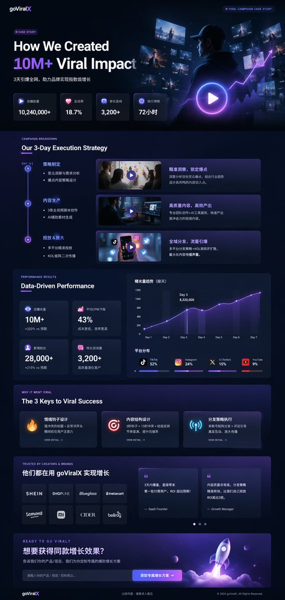
これはよりプロ向けの launch / case-study 投稿に向いた prompt library の例です。LinkedIn や X に合いやすいのは、product framing、指標の階層、そしてソフトウェアブランドらしい信頼感のある見た目を同時に持っているからです。
対応する prompt library の prompt 構造:
{
  "type": "UI/UX landing page mockup",
  "theme": "dark mode, sleek modern aesthetic, glassmorphism, {argument name=\"primary accent color\" default=\"neon purple and blue\"} glowing accents",
  "header": {
    "logo": "{argument name=\"brand name\" default=\"goViralX\"}",
    "top_right_tag": "VIRAL CAMPAIGN CASE STUDY"
  },
  "layout": {
    "sections": [
      {
        "name": "Hero",
        "headline": "{argument name=\"hero headline\" default=\"How We Created 10M+ Viral Impact\"}",
        "visual": "cinematic shot of a person in a hoodie looking at glowing digital screens and graphs"
      }
    ]
  }
}
1本の良いプロンプトをどう展開するか
全部を書き直すのではなく、subject truth を固定して1層ずつ変える方が速いです。
- asset type を固定
- subject truth を固定
- crop / platform を変える
- message goal を変える
- scene / lighting を変える
- 最後に text policy を変える
よくある失敗の直し方
| 失敗の原因 | 先に変えるもの | 理由 |
|---|---|---|
| 画像が汎用的すぎる | asset type と crop | 抽象スタイルより具体的な deliverable の方が強い |
| 1枚に情報を詰め込みすぎ | text 要求と副次要素 | SNS画像は単純な方が強い |
| 文字が崩れる | 文字量 | 長文より短文の方が安定する |
| ブランド感が消える | brand colors、product truth、visual anchor | mood だけだとすぐ漂流する |
| 画像が不自然 | lighting と props | 装飾過多は realism を壊しやすい |
実用的なGPTIMG2フロー
- prompt library で近いパターンを探す
- 上の構造を1つコピーする
- GPT Image 2 workspace を開く
- 正確さが必要なら reference を入れる
- まずはシンプルな初回を生成する
- 1回に1変数だけ変える
- 文字精度が必要なら最終テキストはデザインツールで加える
商品寄りのテンプレートが欲しければ Product Photo Prompt Templates も参照してください。
FAQ
SNS画像プロンプトは通常の画像プロンプトと何が違いますか?
フィード上の見え方、モバイル比率、即時の読みやすさを考える必要があります。画像スタイルではなく、投稿の仕事を記述する点が違います。
投稿文を全部モデルに描かせるべきですか?
通常はおすすめしません。短いフレーズならまだ安定しますが、長文は崩れやすいです。
reference image はいつ必要ですか?
商品、UI、パッケージ、ブランド細部を正確に残したい時です。
このページは prompt library の代わりになりますか?
なりません。これは execution guide です。GPT Image 2 prompt library は引き続き canonical hub です。
まとめ
social media image prompts で本当に役立つのは、例を無限に集めることではなく、正しい投稿形式を選び、その形式に合うプロンプトを書き、ブランドの軸を保ったまま反復することです。