社交媒体图片提示词:10 个更快出图的 GPT Image 2 模板
这里有 10 个可直接复制的 GPT Image 2 社交媒体图片提示词,以及提示词结构、迭代顺序和常见问题修正方法。
如果你搜索 social media image prompts,真正缺的通常不是再看一页空泛的灵感词,而是能直接对应真实发帖场景、真实画幅和真实失败点的提示词。在 GPTIMG2 AI 里,更实用的路径很简单:先在 GPT Image 2 prompt library 看案例,再进 GPT Image 2 workspace 按一个清晰模板逐层改写。
快速结论
- 好用的社交媒体图片提示词,第一步不是写风格,而是先写清素材类型:feed 图、轮播封面、story cover、launch graphic、quote card,还是 before/after。
- 提升结果最快的方法,是先固定主体事实,再一次只改一个变量:格式、场景、文字策略或光线。
- 如果文字准确性很重要,尽量只让模型渲染很短的词句,长文案更适合后期再加。
- 找灵感时去 prompt library。
- 需要稳定迭代、参考图保真或快速 A/B 时,直接用 workspace。
一套能让社交视觉更稳定的提示词结构
很多社交图片不是输在美感,而是输在没有先说明“这张图是拿来干什么的”。建议先从下面这套结构开始。
| 模块 | 要写什么 | 为什么重要 |
|---|---|---|
| 素材类型 | feed post、carousel cover、story cover、launch graphic、quote card、ad creative | 决定构图任务 |
| 平台或画幅 | 1:1、4:5、9:16、16:9 | 防止布局跑偏 |
| 主体事实 | 产品、创始人、UI、包装、品牌色、logo 位置 | 保证图像仍然属于真实品牌 |
| 信息目标 | 发布、教学、证据、引用、促销、改造前后、testimonial | 让图片服务文案,而不是互相抢戏 |
| 风格线索 | editorial、minimal、bold、playful、premium、realistic | 提供情绪方向,但不替代 brief |
| 文字策略 | 不要文字、只要短标题、只要精确引用、只留留白 | 减少文字失真 |
| 负面限制 | 不要额外商品、不要假 logo、不要杂乱、不要不可读文字 | 先挡掉最常见错误 |
基础公式:
Create a [asset type] for a [platform or crop] social media post.
Feature [subject or product] as the main focus and preserve the exact [brand colors, packaging, logo placement, UI details, or subject truth].
The visual goal is [launch, education, proof, quote, sale, transformation, testimonial].
Use [scene, lighting, camera/composition, styling cues].
Leave [negative space or exact text placement instruction] if text needs to be added.
Do not add [extra products, fake claims, distorted logos, clutter, unreadable text, random props].
这套结构在 GPTIMG2 AI 里尤其有效,因为你可以让 brief 保持稳定,只重跑你想测试的那一层变量。
什么时候留在 prompt library,什么时候直接进 workspace
如果你还在下面这些阶段,先留在 prompt library:
- 还在找方向
- 还在看有哪些视觉分类
- 还需要补 prompt 词汇
- 想先对比案例,再自己写 prompt
如果下面这些条件已经成立,就直接去 GPT Image 2 workspace:
- 发帖类型已经明确
- 需要保留真实产品、截图或品牌元素
- 想快速比较多个 prompt 版本
- 正在为同一 campaign 连续产出多张素材
前者是浏览层,后者才是执行层。
10 个可直接复制的社交媒体图片提示词
这些是起步模板,不是最终定稿。把中括号内容换成你的活动信息即可。
1. 产品发布 feed 图
适合做新产品、新功能或新版本的干净发布图。
Create a premium social media launch graphic for a square feed post.
Feature [product or feature] as the hero subject and preserve the exact product shape, logo placement, packaging, or UI details from the reference.
Use a clean editorial composition with layered depth, realistic lighting, and a modern brand-forward color palette.
Leave clear negative space in the upper third for a short headline.
The visual goal is "new launch" rather than hard-sell discount advertising.
Do not add fake badges, unreadable text, extra products, or busy background clutter.
2. Instagram 轮播首图
适合第一张就要停住滚动,并为后续多页做铺垫的场景。
Create a bold 4:5 Instagram carousel cover image.
Feature [topic, product, or idea] with one dominant visual subject and a clear focal point.
Use high contrast, structured composition, and enough clean space for a short hook.
The image should feel polished, modern, and easy to read on mobile.
Add the headline text exactly: "[SHORT HOOK]".
Do not cram multiple ideas into the same frame, add dense paragraphs, or use cluttered backgrounds.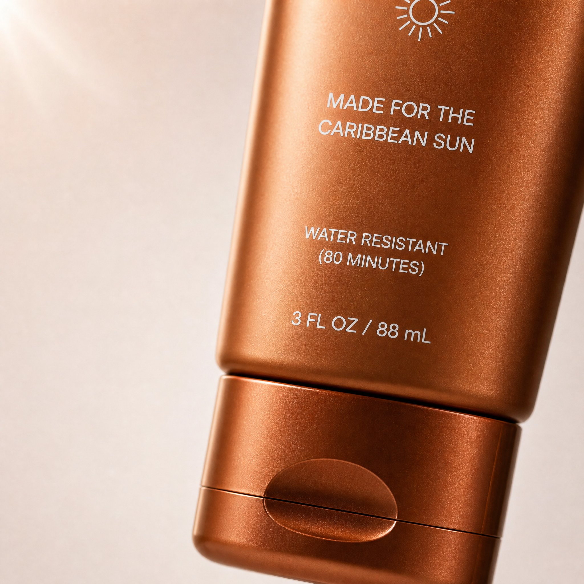
这是 prompt library 里的真实轮播风格示例。它之所以适合这一节,是因为画幅、主体聚焦、留白和 DTC 视觉语气都和“轮播首图”这个任务高度一致。
对应的 prompt library prompt:
Create a high-converting carousel image for this brand [PRODUCT] Ultra-clean, Apple-style design.
extreme macro shot to see the text "MADE FOR THE CARIBBEAN SUN", at the exact position it's currently is in the label. don't change the label or anything else. lots of negative space. Hyper-realistic 3D renders.

Soft gradient background, premium lighting, subtle shadows. Focus on simplicity, clarity, and elegance. No text. Mobile-first, 4:5, high-end DTC aesthetic.
3. 品牌引语卡片
适合内容重点在 caption 或评论区,但画面仍要足够有完成度的帖子。
Create a branded quote-card visual for a square social post.
Use a minimal background, one supporting visual motif, and clean typography space.
Add the quote text exactly: "[SHORT QUOTE]".
Use the brand palette [describe colors] and keep the layout elegant, high-contrast, and mobile-readable.
The image should feel editorial rather than meme-like.
Do not add decorative clutter, fake signatures, long paragraphs, or tiny unreadable text.
4. 产品主体 + 留白布局
适合产品必须清晰可见,但团队打算后续自己加文字的场景。
Create a square product-focused social media image.
Preserve the exact product identity, color, label placement, packaging, and proportions.
Place the product on a clean branded surface with realistic lighting and subtle depth.
Keep the product large and sharp, but leave generous negative space on the right side for later headline placement.
The mood should feel premium, modern, and conversion-friendly.
Do not add extra text, extra props, fake benefits, or secondary products.
5. Before / After 对比图
适合修图、改版、重设计或流程证明类帖子。
Create a split-frame social media image that clearly shows a before-and-after transformation.
Use the left side for "before" and the right side for "after" with consistent framing and clear contrast.
Preserve the same subject identity across both sides.
The result should feel realistic, not exaggerated, and easy to understand in one glance.
Add minimal labels exactly: "Before" and "After".
Do not invent impossible changes, distort the subject, or use noisy visual effects that hide the comparison.
6. UGC 风格创作者图片
适合品牌图过于正式,而你想要更像“真人发帖”的画面时。
Create a realistic UGC-style social image for a mobile feed post.
Feature [person, product, or object] in a believable handheld or casual lifestyle context.
Use natural light, authentic framing, and a creator-style composition that feels spontaneous but still clean.
Keep the product or message visible without making the scene look like stock photography.
Leave subtle space for a short caption overlay if needed.
Do not make the image over-produced, fantasy-styled, or cluttered with props.
7. 季节性 campaign 视觉
适合借节日或活动节点做时效性内容,但又不想做成廉价模板图。
Create a branded seasonal campaign visual for a square or 4:5 social post.
Feature [product or message] as the main subject and preserve the exact brand identity.
Add seasonal cues for [holiday or campaign moment] in a restrained, premium way.
Use a clear focal point, realistic lighting, and a campaign-ready composition.
Leave space for one short promotional line.
Do not overuse seasonal props, neon effects, fake discount stickers, or unrelated decorative elements.
8. Story / Reel 封面
适合竖版内容,需要一眼就清楚的场景。
Create a 9:16 vertical story cover image for social media.
Use one dominant subject, strong vertical composition, and enough empty space in the top and bottom safe zones for interface overlays.
The image should feel bold, simple, and readable on mobile in one second.
Add the headline text exactly: "[SHORT TITLE]".
Do not place important details near the edges, add tiny text, or overload the frame with multiple focal points.
9. Testimonial 背景图
适合真实证明会后期再叠加文字,但底图仍要可信、干净的场景。
Create a calm testimonial-style social background image for a square or portrait post.
Use a clean, premium composition with subtle brand texture, realistic lighting, and a supportive visual motif related to [product, workspace, category, or customer context].
Leave a large centered text-safe area for a testimonial overlay.
The design should feel credible, polished, and easy to read on mobile.
Do not add fake review stars, cluttered props, or busy patterns behind the text area.
10. LinkedIn / X 发布图
适合需要更专业、更可信,而不是更花哨的帖子。
Create a social launch graphic optimized for a professional platform post.
Feature [product, founder, dashboard, or UI] with a clean high-contrast composition and a restrained brand palette.
The visual goal is clarity, credibility, and product relevance.
Leave space for a short headline or metric callout.
Use realistic lighting, crisp edges, and a polished modern software-brand aesthetic.
Do not use childish icons, loud gradients, fake metrics, or busy decorative effects.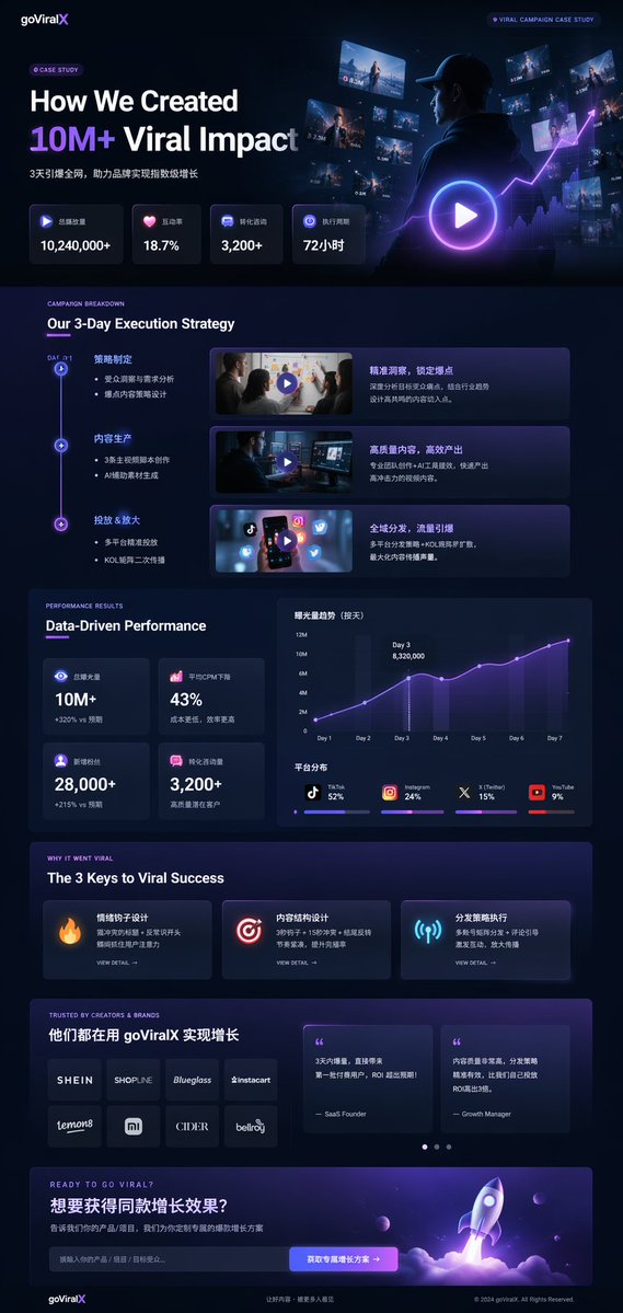
这是 prompt library 里的专业案例页 / 发布图风格示例。它适合 LinkedIn 或 X 的原因,不只是视觉高级,而是同时具备产品 framing、指标层级和更可信的软件品牌语气。
对应的 prompt library prompt 结构:
{
  "type": "UI/UX landing page mockup",
  "theme": "dark mode, sleek modern aesthetic, glassmorphism, {argument name=\"primary accent color\" default=\"neon purple and blue\"} glowing accents",
  "header": {
    "logo": "{argument name=\"brand name\" default=\"goViralX\"}",
    "top_right_tag": "VIRAL CAMPAIGN CASE STUDY"
  },
  "layout": {
    "sections": [
      {
        "name": "Hero",
        "headline": "{argument name=\"hero headline\" default=\"How We Created 10M+ Viral Impact\"}",
        "visual": "cinematic shot of a person in a hoodie looking at glowing digital screens and graphs"
      }
    ]
  }
}
不要重写十次,先学会改一层
更高效的流程不是“写十条完全不同的 prompt”,而是“固定主体事实,只改一层变量”。
推荐顺序:
- 先固定素材类型
- 再固定主体事实
- 再改画幅或平台
- 再改信息目标
- 再改场景或光线
- 最后才改文字策略
例如:
- 轮播首图:4:5、强 hook、一个主题
- 普通 feed 图:同一主体、更平静的构图、不要文字
- Story 封面:同一主体、竖版、安全区留白
- 专业发布图:同一主体、更克制的色彩、更多负空间
这正是 GPTIMG2 AI 实用的地方。你可以保持 campaign 方向不变,却连续产出多个社交素材版本。
结果不对时,先改哪里
| 如果失败是因为…… | 先改这里 | 原因 |
|---|---|---|
| 图太普通 | 把抽象风格词换成真实素材类型和真实画幅 | 明确 deliverable 通常比只写审美更有效 |
| 画面信息太多 | 去掉额外文字要求和次要主体 | 一张社交图想解释太多内容时最容易崩 |
| 文字效果很差 | 少让模型渲染文字,改成只留留白 | 短句比长段文字更稳定 |
| 品牌感丢失 | 补品牌色、产品事实和一个稳定视觉锚点 | 只写 mood 很容易跑偏 |
| 图看起来假 | 简化光线和道具 | 过度装饰往往会伤害真实感 |
| 构图太挤 | 先改画幅,再考虑重写整条 prompt | 很多问题本质是 format 问题 |
一条实用的 GPTIMG2 社交出图流程
- 在 prompt library 找最接近的素材模式
- 复制上面某一个 prompt 结构
- 打开 GPT Image 2 workspace
- 如果产品身份、UI 细节或品牌一致性很重要,就上传 reference
- 先跑一个干净版本,不要一次加太多文字
- 每次只改一个变量
- 如果必须确保排版精确,导出底图后再进设计工具补字
如果你还需要更偏产品图的模板体系,可以继续看 Product Photo Prompt Templates。
FAQ
社交媒体图片提示词和普通图片提示词最大的区别是什么?
社交媒体图片提示词必须考虑 feed 行为、手机画幅、caption 配合和一眼可读性。它描述的是“帖子任务”,不只是“图片风格”。
我应该让模型直接渲染整段文案吗?
通常不建议。短而精确的词句还有机会稳定,长文案更容易出错。更稳妥的做法是先留留白,再用设计工具补完整文案。
最先定义什么画幅?
一旦知道投放位置,就尽早写清楚画幅。9:16 的 story cover、4:5 的 carousel opener 和 1:1 的 feed post,即便主题一样,构图需求也不同。
什么时候一定要用 reference image?
当产品、包装、UI 或品牌细节必须准确时,就该用 reference。只靠 prompt 更适合概念探索,不适合高保真保留身份。
一次应该测多少个版本?
先做一个干净 baseline,然后一次只改一个变量。3 到 5 个受控变体,通常比 10 条互不相关的 prompt 更有价值。
这篇文章会不会替代 prompt library?
不会。这篇更像执行手册;GPT Image 2 prompt library 仍然是案例浏览和发现层的 canonical hub。
最后结论
真正有用的 social media image prompts 不是无止境地收集示例,而是先选对帖子类型,再写出匹配这个类型的 prompt,并在迭代中不丢掉品牌信号。
把这篇当成工作语法,把 GPT Image 2 prompt library 当成案例库,再用 GPT Image 2 workspace 把同一个 prompt 家族更快扩展成一整组社交素材。